Project G

With the coming of the 46th century earth has made great advances in technology to continue the existence of mankind. Yet they find themselves under constant attack from the alien race known as the Zars. Ace space pilot, Kit Striker, is the only one standing between their victory and our survival.


Character Concept
The biggest issue was dealing with the design aesthetic of the film. Being that this is an animated there is very little time for any story or to give in-depth details about the characters. By sacrificing time, emphasis can be placed on design and context. The inspiration behind this film was to pay homage to the science fiction/space opera genre. Adding to that inspiration was hints of stylistic creativity done by Don Bluth. I gathered various image references based on appeal, lighting, mood, aesthetic, or stylistic design. As I progressed further into production my focus became geared more towards the true sci-fi aesthetic rather than implementing hints of Bluth's design. In doing that it proved connect the story with the visuals in a stronger fashion than what I originally set out to do. In creating Kit I wanted to follow the heroic archetype but stylistically mold him to fit the genre while emphasizing my own aesthetic choices. I wanted to make him more of a athletic character with medium build rather than then typical stock, brawny design. With the antagonist of the film, Zar, I wanted to create a creature that evoked relate-able fear and mystery in its design. I decided to use the design of the Preying Mantis and exaggerate its form to create a menace that was formidable and sleek while still evoking that common insect fear.


Environment/Lighting Concept
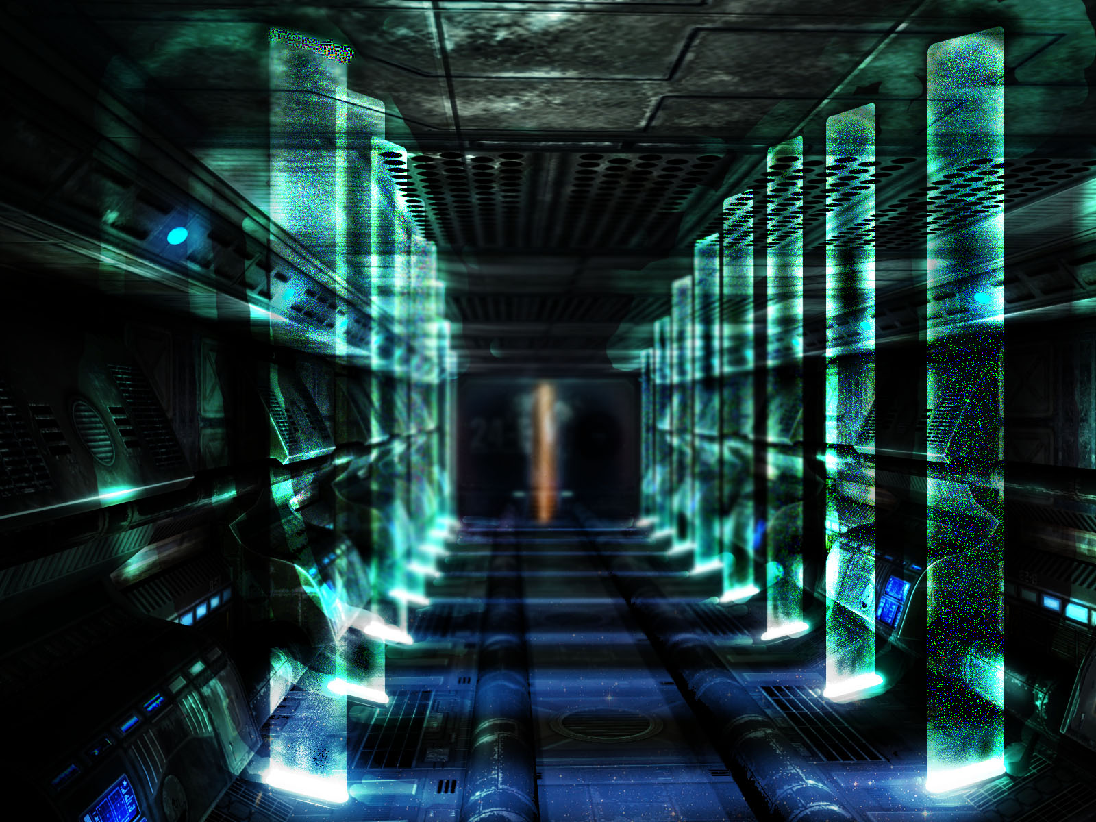
What was brought to my attention in regards to lighting was that emphasis needed to be displayed to drive the audience’s line of sight. The repetitive beams of light created this monotonous pattern that causes you to focus on the lights rather than drive your gaze down the hallway. The mock image above, I experimented with the contrast in the environment. From there added or took away brightness in particular areas to forcibly guide the viewers gaze. Complimenting color was also brought to my attention as well. Instead of a deep blue lighting which would transition to a harsh and alert red lighting, a different take on the situation was advised. Much like in Star Trek the lighting of the hallway is very simple when they are in a pre-cautionary situation the slight desaturation of the lighting is pretty much the same throughout the vessel. It’s not until the ship is critical damaged that the lighting transitions to an elevated warning mood. In turn I started off with a diffuse flood light which transitions to a blue pre-cautionary lighting and finally to a throbbing faint tangerine orange lighting to signal a warning situation.


Original Composite


New Composite
Early on in the post production process my aim was to setup the compositing with the direction to be able to manipulate every inch of the film for the quality I desired. I tried a different approach to my render settings by using the Maya presets and utilizing the render pass option my first go round with the film. Yet due to my lack of knowledge and time restraints the finished piece was to desaturated, and plagued with render frame deficiencies. Taking another approach to the film and my added knowledge of such compositing programs such as Nuke I had a better understanding for how I needed to setup my render layers. I began building the layers from scratch so that I knew exactly what was necessary to make each and every shot substantially better and the turnout was a success.